A Refresh Reveal
By Kari Richardson
October 2023 View more Home
A downsizing Downers Grove couple leaves for the season—and returns to an all-new space
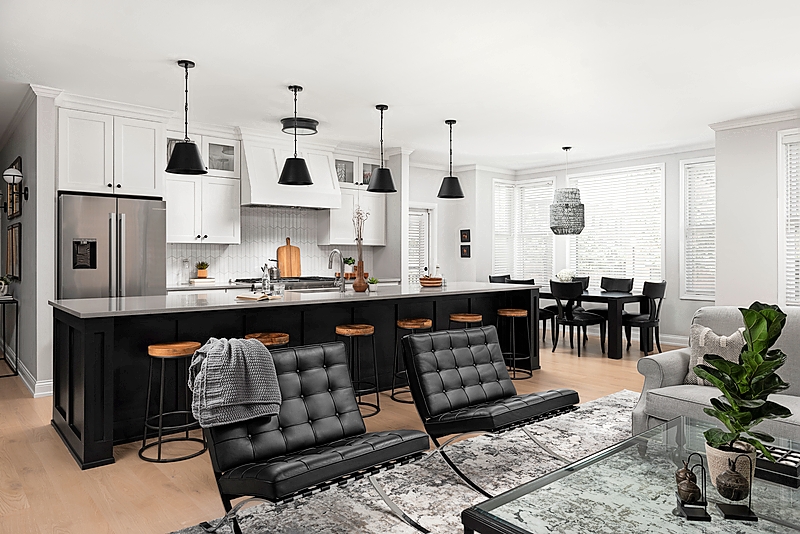
Linda Van Der Aa and her husband, Terry, aren’t ones to shy away from home improvement. They’re veterans of almost any type of project you can name—from remodeling rooms to even adding an entire second story. But when the couple downsized to a Downers Grove condo that need modernizing, they decided to delegate.
Since they were heading to Florida for the winter, they handed off the project to Chad Esslinger, principal of Chad Esslinger Design in Downers Grove (who their daughter had found on Instagram). Esslinger completed a top-to-bottom refresh that left the footprint of the 1,900-square-foot, three-bed, two-bath space intact but added a much-needed updated vibe. Cabinetry, flooring, and appliances are all new, as are most of the furniture and decor.
Esslinger made sure to include thoughtful touches to help ease the transition from the much larger home where the couple had lived for nearly two decades: a double oven, extra storage in the kitchen and bath, and a roomy island with seating for a crowd.
Though he sent Linda and Terry idea boards during their winter in the Sunshine State—and their daughters texted pictures of the spaces as transformed—the “big reveal” came when the Van Der Aas returned in the spring. “We were blown away,” Linda says. “My husband and I are of the mindset that if you hire someone to do it, then let them do it.”
1. (Above) Designer Chad Esslinger mostly left the layout of the kitchen intact, with a few strategic changes: Cabinets now stretch to the ceiling, providing enough storage space to cushion the impact of the couple’s move from a large home to a smaller condo. The island’s footprint stayed the same, but Esslinger made room for extra seating. Cabinetry by Homecrest is from Lisle-based Cardinal Cabinetry with quartz countertops by MSI Chicago.
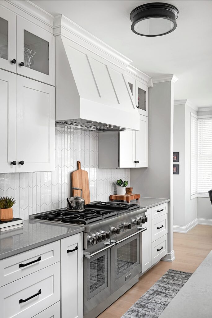
2. The remodeled kitchen makes efficient use of space, with enough room for a Thermador double oven as well as a range hood. Esslinger kept the color palette light and bright, using wood accents for warmth. Glossy ceramic tiles from the Tile Shop are arranged in a vertical chevron pattern. “I had a lot of leeway to do what I thought would work well for them,” he says.
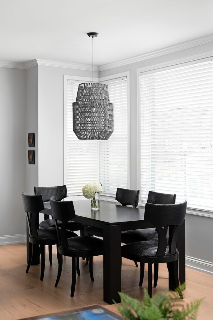
3. Plentiful windows keep the corner unit filled with light. The Van Der Aas mostly purchased new furniture for their Downers Grove condo, with the exception of a few pieces, such as this black dining set. The chandelier is by Zuo Modern.
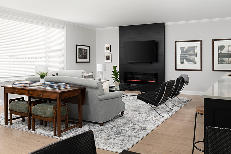
4. Black shiplap creates an eye-catching focal point in the cozy family room. Bonus: The dark background minimizes the appearance of the large TV. The electric fireplace underneath is one of Linda Van Der Aa’s favorite features—and it’s not just for looks: It puts out enough heat to warm things up on cold nights.
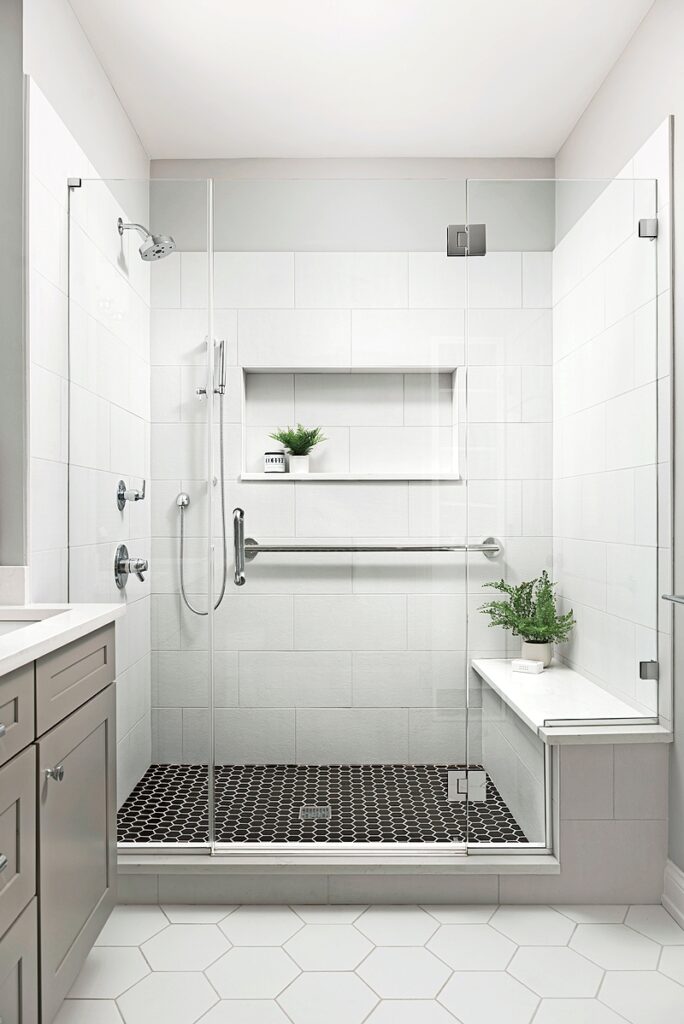
5. Aging-in-place features such as a grab bar and a bench in the master bathroom ensure the couple can remain in their home comfortably for years. Esslinger stuck with a white, black, and gray palette for the bathroom, with different sizes of hexagonal tile from the Tile Shop and cabinetry from Cardinal Cabinetry.
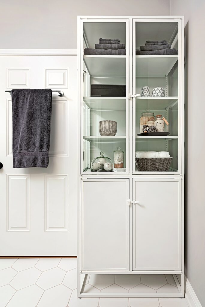
6. Esslinger transformed dead space in a niche behind the master bath door with a pretty and practical cabinet from Crate & Barrel. The curated objects inside are beautiful to look at, but the cabinet also supplies much-needed storage for towels and other necessities.
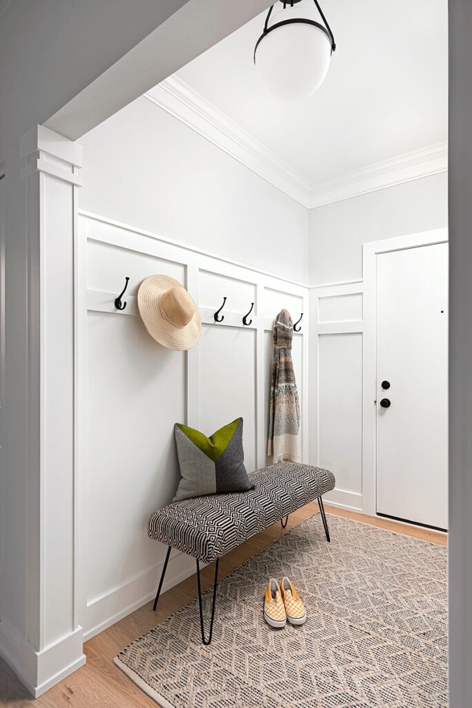
7. A convenient drop zone provides space for visiting grandkids to remove their shoes and coats. Esslinger used board and batten paneling to set the space apart from the rest of the home. The geometric bench and rug are by Surya.
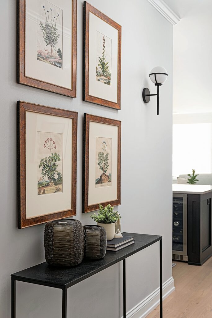
8. “In smaller spaces every little spot ends up having a story or making a statement,” Esslinger says. The designer helped the Van Der Aas select these four pieces from their existing art collection to display in the new entryway. A narrow console fits the space perfectly.
Photos: Picture Perfect House


