Something Old, Something New
By Lisa Arnett
August 2024 View more Home
The renovation of this Victorian balances original charm with fresh touches
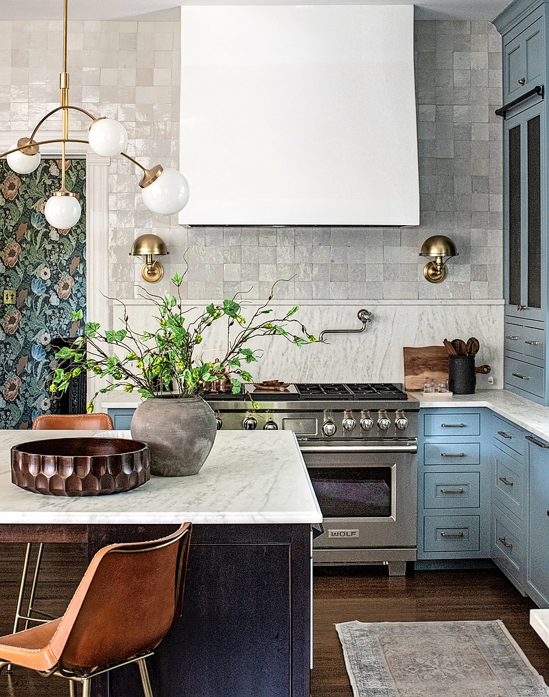
Renovating a historic home to accommodate a modern family is a major undertaking, so when a La Grange couple decided to purchase a Victorian, they tapped Park & Oak interior design studio in Glen Ellyn to lead the renovations. “It’s a marathon, not a sprint, when you’re taking on a renovation with an older home like this,” says Christina Samatas, principal at Park & Oak. “With elements like plaster, putting in new electrical, and working with original windows, it can be tricky.”
The design team first met with the homeowners in 2021 and, over the last three years, has worked its way through renovating the main and upper floors as well as a loft above a detached garage; the latest undertaking is renovating the basement.
“The homeowners really loved the charm of the home and all the wood elements—the casings, the original baseboards, the rosettes,” says Susie Wojno, a junior designer on the project. With Park & Oak’s guidance and expertise, the homeowners were able to maintain many of the Victorian-era details they fell in love with when buying the home while also making every room functional for them and their two children.
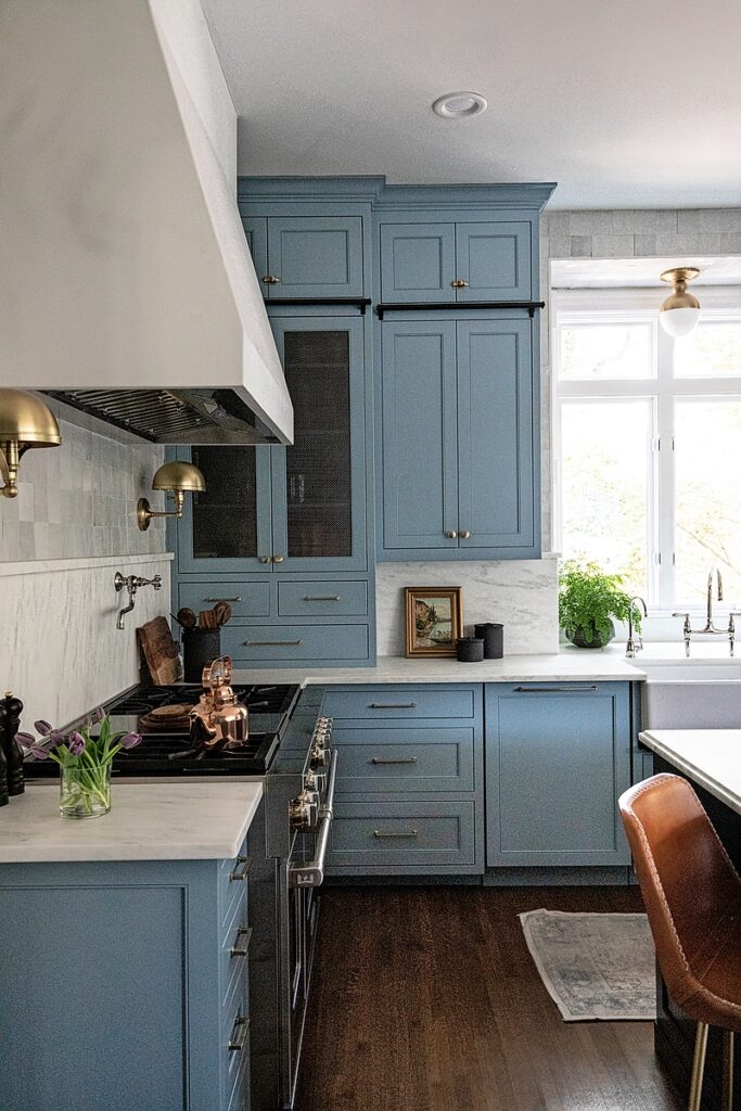
1. (Top and above) “In the kitchen, we wanted to balance traditional elements with a more contemporary feel so nothing feels too much in one direction,” says designer Christina Samatas. “In old homes like this, full walls would be in subway tiles, so we took a different twist on it with these square tiles versus [rectangular] subway-style tiles.” Finding the perfect blue for the custom cabinetry by Walnut Lane Woodworking—Benjamin Moore Van Courtland Blue—was a painstaking process. “We study paint to exhaustion,” Samatas says. “Finding the right type of blue is tricky because we wanted a mid-tone blue that doesn’t read baby blue or navy blue…and once the paint is on actual cabinets, it reads differently than the wall sample. So, once we narrow it down, we have a strike-off made of the cabinet so we can confirm that’s the color we really want.” The chandelier is by Visual Comfort, the backsplash is made of Zellige tiles by Clé, and the countertops are honed Arabescato marble.
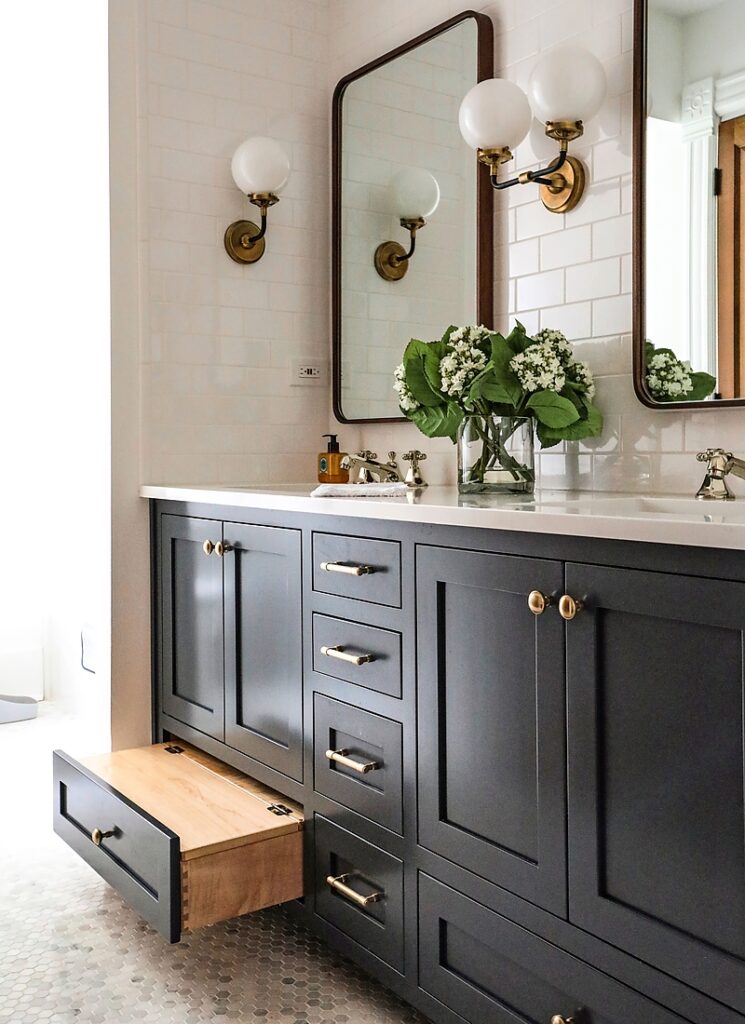
2. The homeowners had some specific requests when it came to designing the shared bathroom for their children. “They have a son and a daughter, and they wanted to create a space that could be neutral for both and highly functional, something they could use now and grow into,” designer Susie Wojno says. A custom vanity features a pull-out step stool that can be converted into a functioning drawer when it’s no longer needed. The floor features marble penny tile by Viking Tile, lighting is by Visual Comfort, and the vanity is painted in Benjamin Moore French Beret.
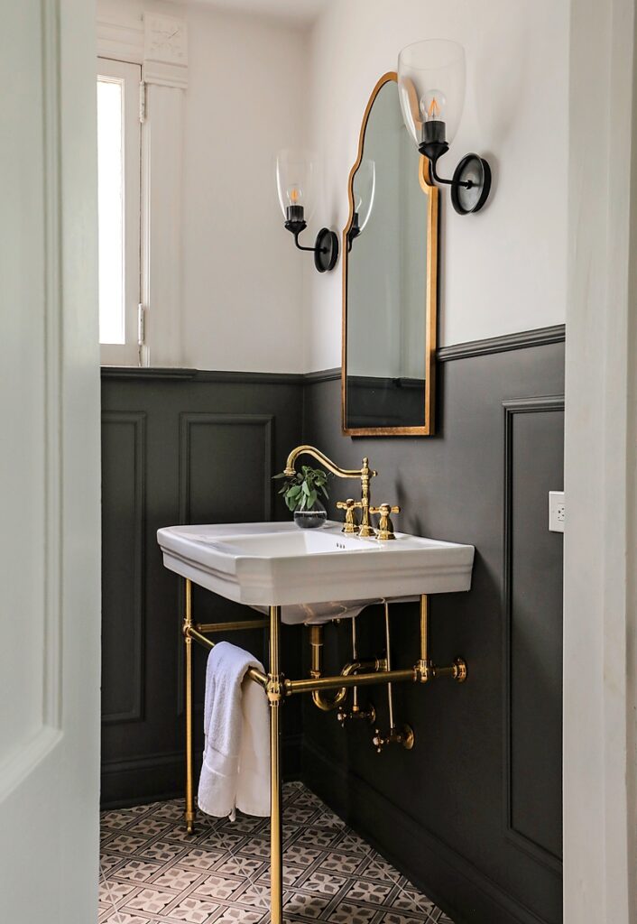
3. The powder room balances authentic architectural elements—such as the original windows and trim—with new fixtures that look as if they could be original, such as this pedestal sink by Signature Hardware, sconces by Visual Comfort, and mirror by Villa & House. “I think the walls on top being really light and the base paint being dark and moody really elevates it in a way that feels interesting but not overdone,” Samatas says.
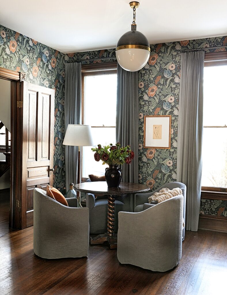
4. The home’s parlor is a small space with a big personality. The Park & Oak team kept the original wood trim and added this eye-catching floral wallpaper. “This room is overflow for the dining area, so they wanted a place for the kids to sit for family functions, somewhere that was a little more accessible to them,” Wojno says. “It’s another place they can do their homework that’s near the kitchen, or a place for the adults to sit and have a cocktail.” They outfitted the room with a Made Goods table, Four Hands chairs, and a Visual Comfort pendant.
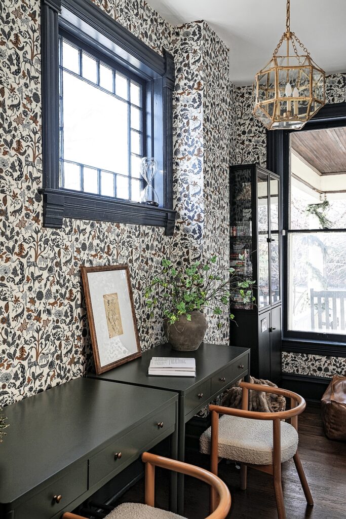
5. In the front of the home, the original Victoria-era China closet was repurposed into a craft room. “The kids love crafts and [the homeowners] wanted it to be whimsical but not have anything that was necessarily drilled into the walls, so as they grow, the space can transition in terms of furniture,” Samatas says. “Right now, it’s a craft room where all the mess goes and you can close the door and not see it.” The wallpaper by Hygge & West (the Foret print in Charcoal) features a botanical-and-animal motif inspired by 1600s Indian Chintz wall hangings. The desks are by Crate & Kids, and the chandelier is by Visual Comfort.
Photos: Renee DiSanto


