

Be Our Guest
By Lisa Arnett
April 2020 View more Featured
Photography by Olivia Kohler
Styling by Joanna Aloysia Patterson
This year’s invitation trends make use of the latest in printing technology and showcase time-tested materials in a fresh, new way. We looked to three local experts to share some of-the-moment options available at their shops: Lynda Junge, owner of Greenstar Paperie in Downers Grove, (greenstarpaperie.com); Kara Gordon, owner of Magnificent Milestones in Downers Grove and Chicago (magnificentmilestones.com); and Lesley Vesevick, owner of Papier Girl in Glen Ellyn (papiergirl.com).
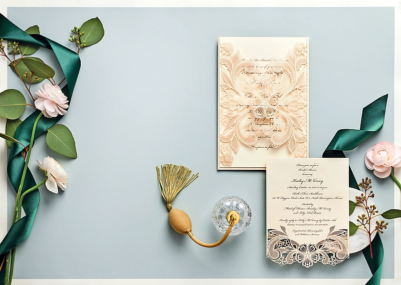
ORNATE SHAPE
For a showstopping invitation with all the intricacy of a lace gown, die cutting is the technique to try.
“A die-cut pattern can be represented in a belly band or maybe a jacket that covers the entire invitation, or simply as a decorative element on the bottom of a single card,” Vesevick says. This design by William Arthur is a beautiful use of die-cut lace. “It’s very intricate, it’s very feminine, and it has a delicate, formal feel,” she says.
“Die cut is not necessarily new, but it’s just so fun,” adds Gordon, who has designed die-cut cards in unique shapes for couples to communicate details that don’t fit on the invitation.
SHEER STYLE
A semi-sheer paper that evokes the look of frosted glass, vellum can help add dimension to an invitation suite. “Everything is centering around texture, and vellum is a different way to incorporate another texture and a great way to add in a bunch of color,” Gordon says.
This invitation features a gatefold made of vellum that’s printed with a design that looks like hand-painted swaths of mauve and green. “The brushstrokes are actually vector images, so they can be doctored up to be whatever coverage and color you want,” Gordon says. “You can overlap them in different ways, whether you just want a couple or if you wanted the entire thing covered.”
“I had a bride’s mother in here the other day who said, ‘Oh my God, this takes me back to my scrapbooking days. I can’t believe this is cool again!’ ” Junge says. “People like old materials done in a new way.”
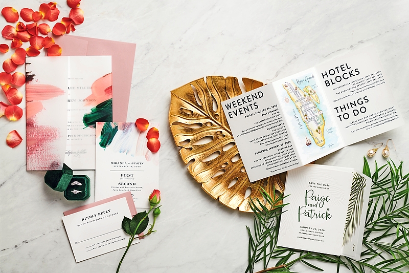
NUPTIAL NAVIGATION
In addition to the wedding venue and hotel, a map graphic might also include points of interest selected by the couple and/or their families, says Gordon. Gordon interviews her clients about their vision for the map illustration and then selects an illustrator accordingly. “If a [couple] likes a watercolor versus like a true illustrated map versus a vintage-looking map, that helps me decide the person I will source it from. I have several different artists I will go to, just depending on the overall look they want,” Gordon says.
Venue illustrations are especially appealing for destination weddings. “It creates a lot of excitement if you’re mailing 100 invitations and you’re asking [your guests] to travel from Chicago to Florida,” Gordon says. “To get it in the wintertime and see this beautiful watercolor with a beach and umbrella, it’s like, ‘I want to be there—I want to be in that map!’ ”
“Once you get this piece done, the client themselves owns it. They have the rights to it,” Gordon says. “I always suggest you include it on the website and to brand everything. You could even have it printed and framed and keep it in your house.”
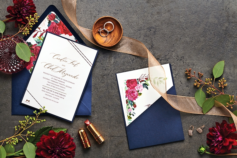
BRIDAL BLOSSOMS + Pretty Pockets
Today’s floral motifs have a hand-drawn or hand-painted look. “They have a very organic feel for sure—not very buttoned-up and not very stiff,” Junge says. This invitation features soft pink blooms and greenery, plus handwritten fonts that serve as a delicate, romantic complement.
Monochromatic florals can be eye-catching as well, especially when printed in this year’s in-demand color. “Dusty blue is definitely—I would say the last year and moving into this season—super hot. Everyone is asking for it,” Junge says. “It’s still soft without being blush … for the bride who doesn’t want ‘the pink wedding.’ ”
At Greenstar Paperie, Junge and her staff create original designs for clients, so these floral motifs can be printed as is in any color, or they can be modified to suit a couple’s specific vision. “We create all of the artwork here and then everything goes out to be professionally printed,” Junge says.
The concept of a lined envelope isn’t new, but today’s printing processes allow greater customization than in the past, Junge says. “I think it’s just a very unexpected detail that people like.”
For this invitation suite, Junge designed what she calls a “bossy floral” for the RSVP card and envelope liner, which provide bold contrast against the simple ivory invitation with metallic foil lettering. At this couple’s February wedding, the tablescapes will look like they were pulled right off the page. “[They’ve] got an ivory tablecloth with navy and the bold burgundies happening for the actual [floral] centerpieces,” Junge says.
This invitation design holds the RSVP card and details card in what Junge calls a clutch. “It’s a pocket on the back that stuff is tucked into, so it’s not the loosey-goosey cards all over the place,” she says. When paired with a dark navy envelope and white ink for the addresses, it all wraps up into a truly dramatic package. “That is some mailbox hotness right there that does not feel like the AT&T bill,” Junge laughs.
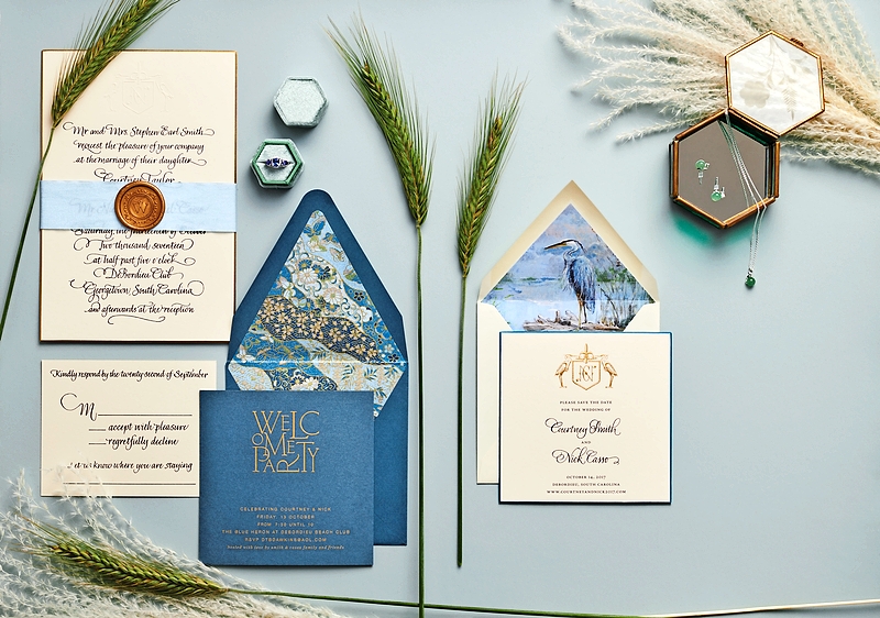
DOWN TO EARTH
Like denim, this dusty blue is a neutral. “Some people who choose this dusty blue, maybe all their bridesmaids are wearing different shades of blues and roses and nude colors. You really can do anything with that kind of dusty palette,” Vesevick says.
Nature-inspired invitations are a fitting choice for outdoor weddings. “Maybe it’s at the Morton Arboretum; maybe it’s a beautiful barn wedding,” Vesevick says. “This [suite] is super elegant. You’ve got your clean white paper, your lettering is very clear and clean, but you’ve got the nature elements and you’re bringing in some organic items with the ribbon and the wax seals.”
Designed by Arzberger Stationers, this invitation suite features a waterscape motif with a blue heron on the envelope liner as well as noninvitation items, such as a tag to attach to your guests’ welcome bags. “People like to have components of their whole theme brought into all of their stationery pieces,” Vesevick says. “It might not even be something that your guests remember specifically, but it’s a feeling of cohesiveness.”
SUBTLE PATTERN
Prints and papers with a marbled effect are a trend that gained speed last year and is expected to remain popular this season, Vesevick says. “It’s a kind of a modern look,” she says. “There’s a formal component to it, and also I think featuring the foil [lettering] with it is just very classy.”
This invitation suite by Bella Figura features ivory and gray marbling on the envelope liner, RSVP postcards, and invitation itself. “It’s a really soft, subtle element,” Vesevick says. “It feels timeless, but it still has trend to it. I don’t feel like you’re going to look at that and say, it’s trendy just because of the marbling.”
Though traditional marbling is made by swirling different colored paints on the surface of parchment, this is a modern facsimile created by the magic of digital printing. “It’s a pattern that’s digitally printed on paper. There is no texture to it—when you run your fingers over it, it’s smooth,” Vesevick says. “It’s printed digitally first, and then the foil plates are made to do the text.”
