In Good Company
By Naperville Magazine
April 2022 View more Home
Interior design has its own set of rules—things that might be considered untraditional in any other trade. For Bryn Wulf, a designer with Wheaton-based Two Hands Interiors, one of those rules is that it’s completely fine to start a project with furniture placement already mapped out.
“You can maximize and make the most of your home’s footprint with good design,” says Wulf, using the example of Nancy and Kent Hoskins’s north side Wheaton remodel, in which the layout for the kitchen and adjacent family room was carefully planned before renovations began.
The Hoskinses purchased their 3,700-square-foot, five-bedroom, four-bath home to be closer to their adult children and grandchildren. Wulf, who was hired for the remodel, which prioritized family gatherings and visits from grandchildren, points out that no additional square footage was added. The project was completed in 2021.
Wulf drew on the southern concept of the “keeping room,” a multipurpose space adjacent to the kitchen, as she designed the layout. She knew both rooms would need to work in concert to accommodate the extended family gatherings the homeowners had in mind. The 25-by-17-foot kitchen, for example, can seat 10 people between stools at the island and a table with built-in seating.
“A lot of people think that buying furniture comes last, but you can actually paint yourself into a corner that way,” she says.
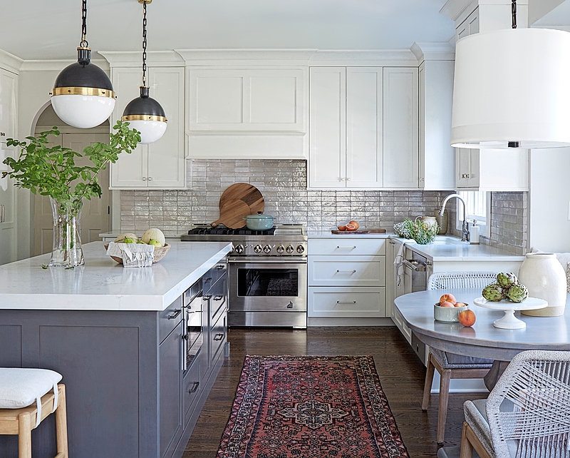
A pair of classic black-and-gold Hicks pendant lights anchors the kitchen island.
A vintage, 100 percent wool rug found on Etsy is easy to clean and will hold up to years of wear.
Moroccan-style Zellige tiles from Zia Tile are handmade, distinctive, and fixed in place using minimal grout.
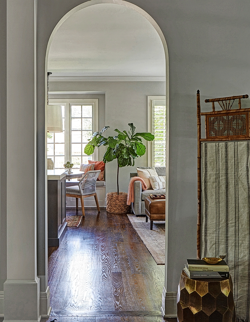
Many of the home’s doorways are arched—a charming feature that Wulf recommended keeping in order to create harmony with the traditional exterior. “We were walking a tightrope to balance traditional and more modern features,” she says. “The exterior of the home is a riff on the Tudor style. It blends into the neighborhood beautifully, even though the home is much newer than many of the surrounding homes.”
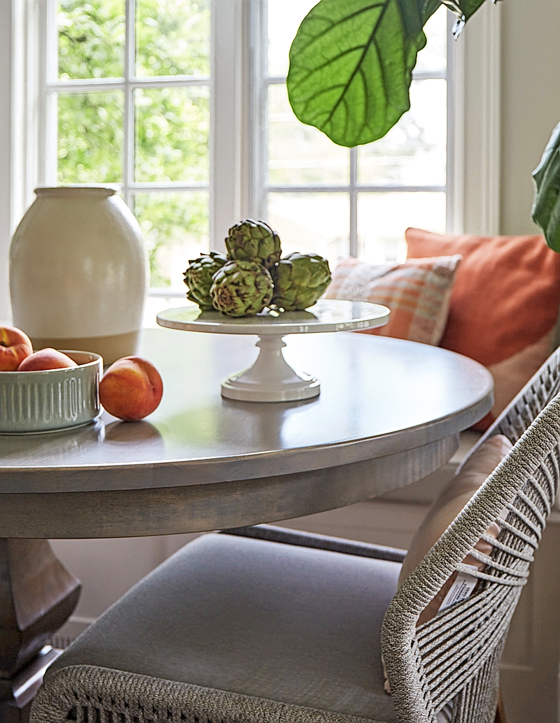
The north-facing kitchen eating area offers views of a nearby park, as well as a just-picked color scheme. When selecting a table for built-in seating, Wulf offers this expert tip: Opt for one with a pedestal base, which fits more diners and allows for smoother entries and exits. Table and chairs are from Walter E. Smithe.
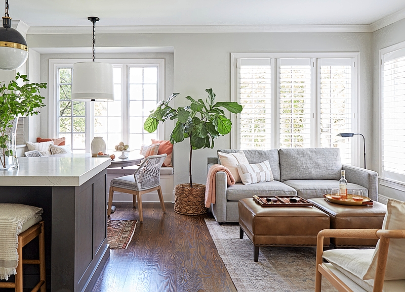
With long lead times and material shortages, sourcing furniture has become more challenging during the pandemic years. One of Wulf’s solutions has been to turn to vintage items, such as the pair of leather ottomans she found at the Perfect Thing in Wheaton. “The leather already has that beautiful patina,” she says, “and they fit the space plan perfectly.” Plantation shutters matched window coverings in other areas of the home and provide needed privacy from the park.
Construction: De Groot Construction Co., Window Treatments: Hang & Shine Inc.


